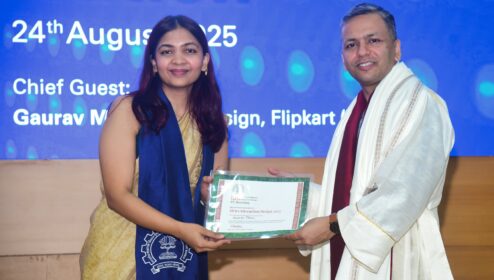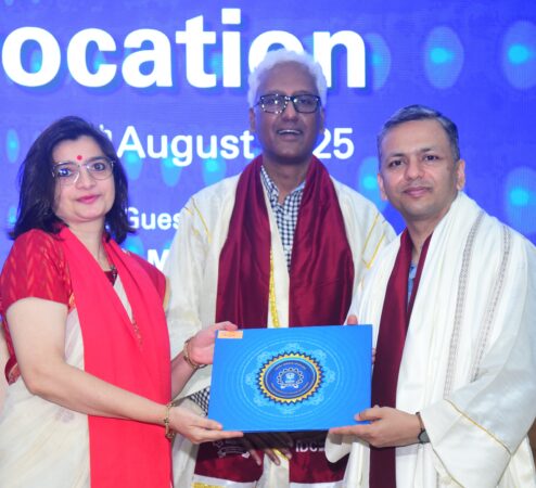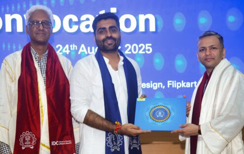


Feeling deeply grateful and humbled to have been invited as the Chief Guest at the convocation ceremony of my alma mater, IDC School of Design, IIT Bombay, a place that shaped so much of who I am today.
When Prof. Venkatesh Rajamanickam invited me to be the Chief Guest at the convocation, my first reaction was, “Who, me?” Because it feels like just yesterday that I was receiving my degree at the IIT convocation hall. And to this day, I still consider myself a student of design.
To be on stage this time, addressing the graduating class, was both surreal and incredibly special. Walking back into the campus was a moment of pure nostalgia. A reminder of how this place gave me not just an education, but a way of seeing, questioning, and contributing to the world.
A heartfelt congratulations to the graduating designers of 2025! You’re stepping into a world of endless possibilities. I can’t wait to see how each one of you will use the emerging technologies to shape the future with your creativity and imagination. Stay curious, keep learning, and carry forward the spirit of creativity and humanity that this school instills in all of us.
Forever proud to be part of this community.
Photos courtesy IDC School of Design
Here’s the full speech:
Convocation address
Good morning, esteemed faculty, staff, proud parents, and the stars of the day – our graduating designers. Congratulations to everyone who’ll be receiving their degrees today. This is a milestone to cherish and remember in your academic journey. And also the beginning of many new journeys.
When Prof. Venkat invited me to be the Chief Guest at this convocation, my first reaction was, “Who, me?” Because it feels like just yesterday — only 23 years ago — that I was sitting just like you are, receiving my degree at the IIT convocation hall from Mr. Nandan Nilekani. To this day, I still consider myself a student of design. The learning never really ends; the industry may evolve, the titles may change, but the spirit of curiosity that brought us here is something we carry for life.
That’s why standing here today is both humbling and deeply personal. I’m incredibly grateful and honoured to be here — at the convocation ceremony of what I truly believe is one of the finest design schools in the world. A school that doesn’t just teach design, but nurtures a way of thinking, a way of seeing, and a way of shaping the world.
What makes IDC special are the people — the faculty and staff, as well as the students. And for decades, IDC has produced designers who didn’t just create beautiful work — they solved deep problems, shaped cultures, and created lasting impact. IDC’s corridors have echoed with the wisdom of brilliant teachers who have shaped minds, and also questioned, and shattered our assumptions.
I feel fortunate to have studied under and learnt from the greats like Prof. Kirti Trivedi, Prof. Athavankar, Prof. GV Sreekumar, Prof. Anirudha Joshi, Prof. Ravi Pooviah, and many more. I also got the opportunity to work with some of them — my first job was with Media Labs Asia where Prof. Anirudha Joshi was the advisor and we worked on many concepts to take technology to the masses in India. And this was the pre-smartphone era. I was also fortunate to work with Prof. Trivedi at the K-Yan Design Centre to build digital products for group learning in the classroom setup.
Over the last two decades, the design industry has transformed beyond recognition. When I graduated, the dot-com bubble had just burst. The internet was still young, web applications were simple, and job titles like Interaction Designer or UX Designer were virtually unheard of. Fast forward to today, and the picture couldn’t be more different — design has become central to how businesses build and grow, and a large number of design graduates now stepdirectly into roles shaping physical and digital products or creating services that impact millions of lives.
I feel the industry perhaps will also undergo a significant metamorphosis over the next decade. Today, I want to speak to you about what changes I am seeing in the industry with the advent of Generative AI. There’s a lot of fear, speculation, and noise, around the topic of Generative AI and what it means for designers.
I’m quite certain all of you have been experimenting with ChatGPT or other large language models — and some of you may even have used them to write parts of your reports, perhaps with or perhaps without your professors’ knowledge. I hope you’ve also explored creating images, animations, videos, and even audio with generative AI, pushing the boundaries of what’s possible with just a prompt.
Many experts are calling Gen AI as the next paradigm or platform shift, and the beginning of a new technological era. In the past, we’ve had technological eras such as – Smartphones, Cloud computing, Web, Open Source; PCs; and Mainframes. Each of these have lasted about 15-20 years and were built on top of the previous set of technologies but offered a significant departure in terms of the focus, investment, and gains for the users.
In each of these eras, many new products as well as companies emerged and many that were not able to change and adapt became irrelevant. Think about the mobile apps that you use everyday — most of these are about 15 years old.
Experts estimate that the Gen AI era will also last about 10-15 years. New companies will emerge that’ll use the power of Gen AI and will completely disrupt the way we do work today.
So what makes Gen AI such a big disruptor?
I feel there are two key factors — accessibility and cost.
Let’s look at what makes this technology accessible: It is available to everyone inside their browsers — with the most well understood UI – natural language. People don’t have to learn a new tool or UI. My mom can use it and I don’t have to teach her how to!
What about the cost? Today, it takes less than a rupee to generate a stunning image with Gen AI. Something that otherwise would have taken a min of about 5,000-10,000 times more when done manually.
Unlike the previous eras, the Gen AI era enables creators — it enables individuals, large and small companies to create content, media, and code significantly faster and cheaper. It can automate repetitive and mundane tasks. This kind of automation so far was only limited to factory floors and affected the blue collared workforce. It is the first time in recent history that the work of knowledge workers is being impacted in a big way.
Today, we see all kinds of content being generated with tools like ChatGPT — from articles and LinkedIn posts to emails and marketing content. Companies are using AI to summarise large quantities of data. Real-time translation has also become a reality — with initiatives like Bhashini, where IIT Bombay is also involved, the government and the industry are making huge strides in enabling conversations across Indian languages.
At the same time, many companies are harnessing AI to build smarter chatbots that help customers with their queries. Now LLM-powered chatbots are emerging as the first point of interaction between businesses and their customers. They’re fast, scalable, available 24/7, and in many cases, they’ll save companies millions while giving customers instant responses.
Large vision models are now powering the creation of images, animations, and videos — and this technology has already found countless uses in the industry. Marketing teams are producing ads and campaigns with generative AI, and it’s becoming common to see AI-generated visuals in blogs, and presentations. For illustrators, industrial designers, and architects, the ability to turn a rough pencil sketch into a polished, realistic visualisation within minutes is a game-changer. And it doesn’t stop there — from generating 3D models to composing audio, all it takes today is a simple text prompt to bring ideas to life at incredible speed.
So what parts of the design process are really being impacted?
Let’s think about the design process that most of us follow in any project. We begin with a challenge. The first step is to understand the problem — define the part of it we want to solve, frame and reframe the problem statement — all while staying in the problem space. Then we move into the solution space: ideating possible directions, prototyping a few, and testing them with real users.
I feel Generative AI technologies will have a profound impact across the process. In the problem space, large language models can help us quickly learn about the challenge by summarising existing research, case studies, and insights. And in the solution space, from ideation to prototyping, content and media creation, Gen AI will dramatically reduce the time it takes to bring ideas to life. What once took weeks or months might soon take days — or even hours.
So no matter in which aspect of product development, consultancy, or education you are engaged in, mastering Gen AI tools will be critical to your success. And designers who learn how to use AI well will certainly have an edge over those who don’t.
Today, there’s a lot of conversation — and yes, even fear — that Generative AI will take away the jobs of future designers. The reality, at least so far, is quite different. The actual impact on design jobs has been minimal. What we are seeing instead is an expectation in the industry for greater efficiency — companies want designers to integrate GenAI into their workflows to move faster and smarter. I’m also noticing something else: in many cases, the quality of certain design deliverables has actually improved because AI is helping refine, polish, and expand creative possibilities.
Today, almost every industry — digital product development companies, animation and film studios, video game producers, are all looking to optimise their workflows and improve quality through Gen AI.Will this eventually translate into job losses? The honest answer is: we don’t yet know. But what is clear is that the nature of design work will evolve. AI will take over some of the repetitive, production-heavy tasks — freeing designers to focus on the more human, more strategic, and more imaginative parts of the craft.
So what skillsets should we focus on for the future?
The answer lies in focussing on what can’t be automated. I feel that certain design tasks may get completely automated while some will be augmented. Tasks like creating images, illustrations, icons, screen layouts, and prototypes will get automated and designers will need to constantly relearn faster ways of doing them throughout their careers.
On the other hand, we’ll have activities that’ll get augmented. I feel these should be the primary skillsets to focus on for future designers. These will include: Curiosity, Critical thinking, Storytelling, HCI, Interdisciplinary collaboration, Leadership, Resilience, Empathy, Humane/ ethical design, Social sciences, and Business.
These are the very qualities that make you human and will remain irreplaceable. That is your true advantage, and no algorithm can take it away.
What about areas besides design?
Let me briefly cover some of these as well.
Broadly, Gen AI technologies are affecting every aspect of the product lifecycle. From product conception, design and development, marketing and sales, adoption and usage, support and service, to refinements.
Not long ago, building a product meant raising big money, hiring large teams, and spending months — sometimes years — to get something meaningful out into the world. But in the GenAI era, that playbook has completely changed. Today’s startups are leaner, faster, and far more nimble.
Startups with teams of barely 10 to 15 people are producing products at an incredible speed. Just a handful of people are building entire products in a matter of days — relying on AI as their designer, their content writer, coding partner, their marketer, even their customer support team.
In this AI era, the power of being a generalist has never been greater. The walls that once separated adjacent functions such as product management, UX design, and programming are crumbling. With generative AI, a product manager can sketch and test an interface, a designer can generate working code, and a programmer can map out entire user journeys.
Suddenly, the toolkit of one is becoming the toolkit of all. And this isn’t about replacing specialists — it’s about expanding what each can do.
The future belongs to those who are curious enough to cross boundaries, bold enough to try new tools, and wise enough to combine strategy, design, and technology into a single flow of creation. With AI as your co-pilot, you’re no longer confined by your job title — you’re free to be a maker, a builder, a storyteller, and an innovator, all at once.I’ve spoken about how GenAI will lead to tremendous efficiency in the workflows. And it is also opening up new opportunities in areas that designers need to explore and advance.
I feel this era will see us going beyond screens. Voice-first, conversational interactions, multi-modal interfaces will become the norm. Multimodal interactions will combine voice, text, and gestures for fluid, human-like experiences. Ambient computing will be a reality. Zero-UI, agentic-workflows will make computing invisible. There’ll be context aware actions leading to ubiquitous computing. For example, your smart home might automatically play lively music if it detects you’re not in a great mood. Or your phone might book a cab automatically when it detects that your work is almost done.
So far we’ve only seen these in sci-fi movies but these will become a reality and designers need to shape them.
Gen AI technology is improving by leaps and bounds every few months. Designers will havesome very powerful tools at their disposal to envision new things. There’ll be new ways of working and designers will need to relearn and adapt quickly.
Learning today goes beyond the academic setups. So consider this convocation to be the beginning of new ways of learning. Your success in the design profession will depend on how you constantly learn and evolve over the years.
Your teachers have nurtured you, your peers have given you competition and companionship, and this institution has given you the foundation to stand tall in the world of design.
You are graduating at possibly the most exciting time in the history of design. Never before have we had so many tools, so much access, and such a global audience hungry for good design. Your work will travel faster, touch more lives, and shape more futures than you can imagine.
I want to remind you that:
You come from a school with a history worth celebrating. You carry the responsibility of designing the future — one pixel, one curve, one experience at a time. You have tools your predecessors never dreamed of. And you have the ability to keep learning, forever.
Keep trying new things, keep designing, keep building, and build for India. Don’t play small. Try wild ideas. Make bold choices. And when in doubt prototype and test
And remember… Design is not just what you do. Design is how you leave the world better than you found it.
Once again, congratulations, class of 2025!
Thank you!
